 |
| Rendering of Proposed Centrepointe, Lexington, Ky. |
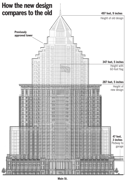
Yesterday, Dudley Webb unveiled his modified proposal for the Centrepointe development (47 page PDF). The modification includes several major changes. Most notably, the “peak and spire” design is gone being replaced with a flat top roof and a 60-foot flag poll. The original proposal was to be about 500 feet tall (35 stories); the modified structure just under 290 feet (23 stories). BizLex has a good summary of the differences in the two proposals, but Herald-Leader columnist Tom Eblen points out the obvious: with the economy in its current state, he doesn’t “expect to see it rise out of the pasture anytime soon.”
The proposal emphasizes the incorporation of and reinterpretation of historical architectural styles. The proposed structure is immensely better than the original proposal, but I’m still not entirely certain how the structure will complement the rest of downtown or how it will be uniquely Lexington. Although the tower doesn’t rise adjacent to the sidewalk, it is close to the Main Street side questioning what shadows it might cast.
Plus, I’ve posted before on my growing fondness of the downtown horse fence. It truly would be a great area for a 1.7 acre downtown park (a real park, with trails, etc.). That said, the proposal does offer the site for use by Spotlight Lexington and other downtown festivities associated with the World Equestrian Games.
Rendering from Kentucky.com as modified from the Centrepointe Application.

I was wondering how long it would take you to post this. I am curious as to how it can call itself CentrePOINTE now that it is a big square.
Yeah, the name doesn't work quite as well does it… Although the uber-patriotic flag will act as a point.
Keep on commenting… 🙂
I like the new design better, but I would prefer that it remain a park. I like the greenspace!
When I first saw this I thought it was a cop-out. Its basically the same design but without the spire. On review this morning, I think I like it, mostly because when I look out the window of my office at some of the older buildings in Lexington, they share this flat-topped, neo-Federal sort of look. Just please, get rid of that flag pole.
Sans the flag pole, it would probably be better. I don't mind the flat top, I just need to see more renderings as to how it will appear from the streetscape to render my final verdict.
Still, there are a lot of unanswered questions about funding, timeline, etc. It ain't over…